
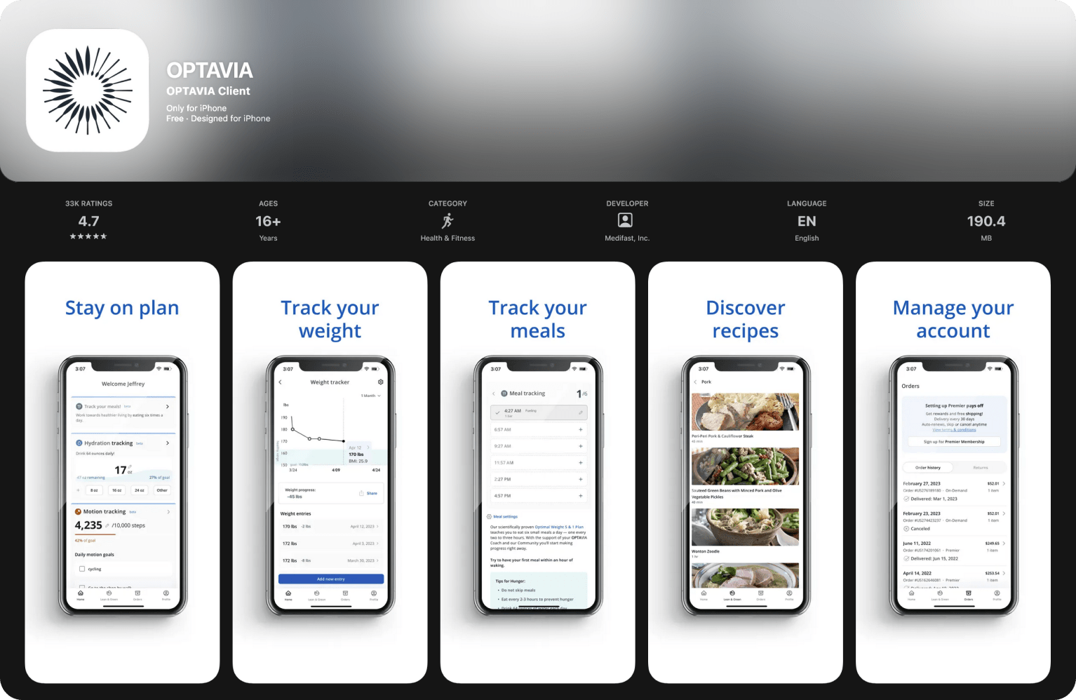
2.3 → 4.7+ App Store Turnaround
Turning a company's biggest liability into a product that actually worked for its users.
My Role: Director of Product Design. The actual job was broader: product strategy, team building, process design, and hands-on design execution.
Timeline: 18 months
Core Outcome: Transformed a 2.3-star app into a 4.7+ star product. +35% user retention. +40% daily active users. -75% UX-related support tickets. Built the design organization from zero.
The Real Problem Wasn't the UI
When I joined, the flagship app had a 2.3-star rating. The surface read was obvious: bad usability, frequent crashes, confusing navigation. The company had tried to fix it by hiring an external agency. That failed, and I inherited a stalled handoff.
But after digging in, the app wasn't the problem. It was a symptom. The actual problems were:
- No internal product design function existed. Design decisions were made ad hoc, by committee, or by the agency.
- Teams were siloed and misaligned. Design, Product, and Engineering operated with low trust and no shared process.
- The company didn't see itself as a digital product company. They were an offline-first brand that happened to have an app. That mindset shaped every decision.
- Users had given up. Reviews reflected genuine frustration, not with a specific feature or flow, but with the feeling that nobody was listening.
Fixing the UI without fixing the organization would have produced a slightly better-looking version of the same broken product. So I scoped the job differently than what was asked.
What I Actually Did
1. Diagnosed the real situation, not the brief
Before proposing any solutions, I spent the first weeks understanding what was actually happening.
I read hundreds of App Store reviews and support tickets, grouping complaints into themes. The top issues weren't what leadership assumed. Users weren't asking for new features. They were telling us the app felt unreliable and confusing at a basic level.
I dug into analytics to find the data behind the sentiment: where users dropped off, which features had near-zero engagement, where the gaps were between what we built and what people actually used.
I led user interviews directly, with support from the internal research team. The key insight wasn't about usability or visual design. It was about the product solving the wrong problem entirely.
The app was built around ecommerce for Clients. But in practice, Coaches handled ecommerce on behalf of their Clients. The app was trying to serve a workflow that didn't exist. Users didn't see it as a helpful tool because it wasn't built around how they actually worked. That's a product strategy problem, not a design problem.
2. Built the team and the process from scratch
The diagnosis made one thing clear: we couldn't build a good product without a functional team. So I built one.
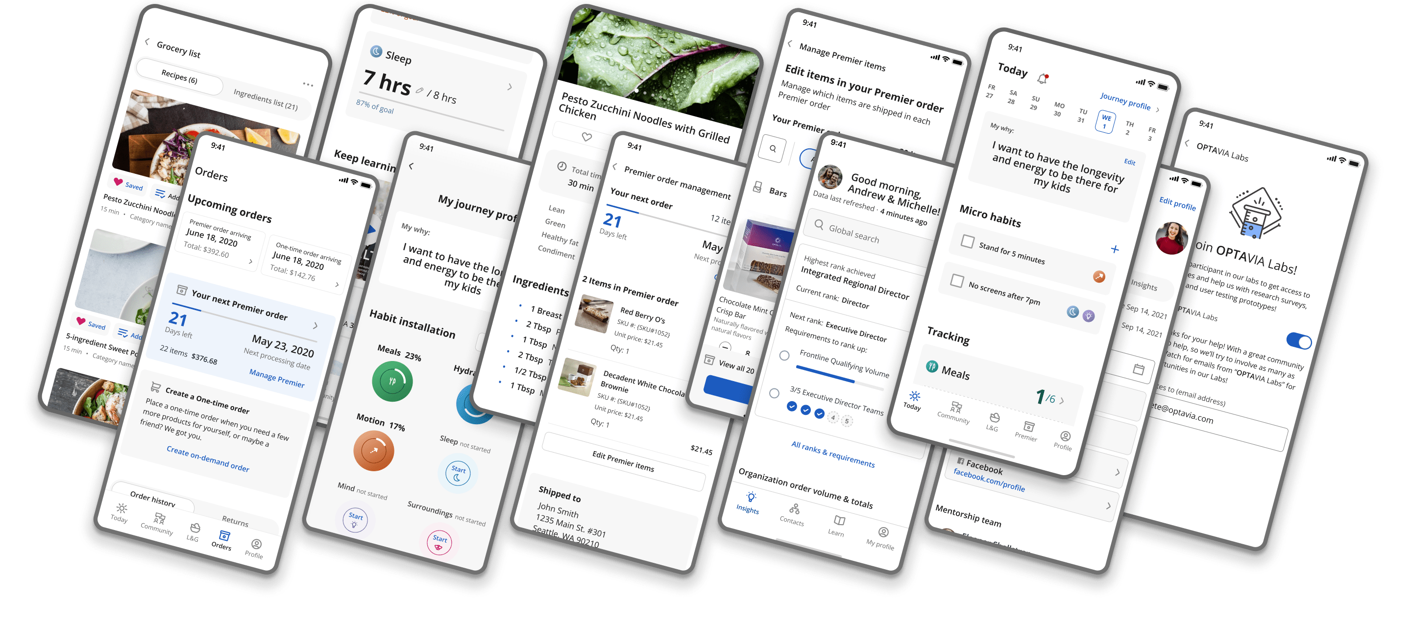
I hired and mentored designers, created a career ladder, and established a mentorship program. But more importantly, I changed how design worked within the company. I introduced design critique as a formal practice. I started user testing as a regular cadence, not a one-off. I made sure designers had direct access to user data and research, not filtered through product managers.
I also invested in how the broader company thought about user experience. I ran trainings on UX thinking, ways anyone in the company could incorporate user-centered approaches into their own work, and similar sessions. Everyone in a company contributes to the user's experience, whether they realize it or not. The goal was to get people thinking beyond just their role so they could collaborate better and improve the overall product. This wasn't a one-time initiative you check off. It was ongoing work to shift how people approached their jobs.
3. Ran the redesign as a product strategy, not a design project
With a team in place and organizational alignment, we executed deliberately.
We broke the overhaul into Agile sprints, shipping value incrementally rather than betting everything on a big-bang relaunch. I was hands-on throughout: leading design direction, making UX decisions in the weeds, prototyping flows, and working directly with engineers on implementation tradeoffs.
We prototyped and tested with real users before committing anything to code. The loop was tight: prototype → test → learn → iterate. This de-risked every major decision.
We launched to a beta group first, monitored performance, gathered feedback, and iterated before the full rollout. No surprises on launch day.
Results
Over 18 months, the app went from the company's biggest liability to a product users actually valued. The app still supported what happened offline (coaching, habit building, community), but it was no longer working against those things. And the more lasting result was organizational: the company now had an internal team, a process, and a way of thinking about product that didn't exist before.
| Metric | Result |
|---|---|
| B2C App Rating | 2.3 → 4.7+ |
| B2B App Rating | 4.9 |
| User Retention (90-Day) | +35% |
| Daily Active Users | +40% |
| UX-Related Support Tickets | -75% |
What This Project Shows
The 4.7-star rating is the headline number. But what actually made it happen was recognizing that the app's problems were organizational, not visual, and then doing whatever the situation required: hiring, mentoring, running UX trainings across the company, establishing process, making design decisions, prototyping, and working directly with engineers.
That's how I work. I figure out what the real problem is, then I do what it takes to solve it. Whether that's setting strategy, building a team, or getting into the details myself.